School of Design Debuts New Logo Designed by Students
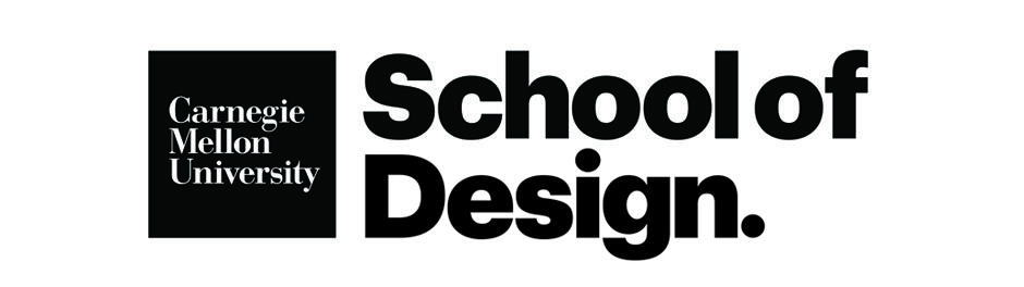
A team of students from Carnegie Mellon University's School of Design recently developed a new logo for the school. The students, including Yoshi Torralva, Langston Wells, Alice Cai, Mia Tang, and Angela Lee, developed a logotype and brand system that "reflect our alumni's work, the place we work, and our attention to craft, vision, and process." Along with the new logo, the team also developed a new undergraduate admissions portal aimed at helping prospective students see themselves as future designers.
The new logotype marks a unique turning point in the School of Design. Alongside this visual rebrand, the team of students has worked diligently to articulate a newfound future for the school. A vision that reflects our commitment to decreasing the barrier of entry into the field of design.
"Through our research—and lived experiences—of applying to CMU, we tackled how to allow prospective students to envision themselves as future designers," said Torralva. "Our most significant endeavor was developing a website that directly targeted students to learn about the field of design—and even consider applying to CMU."
The logotype and brand system reflect our alumni's work, the place students work, and our attention to craft, vision, and process.
"When setting out to create a new logotype, it was without a doubt that we wanted to choose a typeface that an alumnus created," continued Torralva. "As a result, we landed on the bold yet youthful typeface, Graphik, by Christian Schwartz. Additionally, we were so fortunate to have the opportunity to collaborate with Christian on this rebrand as well."
The type was placed on a meticulously crafted grid structure that was made to adapt to any medium.
"Through this grid structure, the logotype has a stage presence that can dance between being energetic and traditional," added Torralva. "We wanted to commemorate how many students' design careers began at CMU in the logotype. As a result, the bowl of the 'g' was altered to match Margaret Morrison Carnegie Hall's rotunda, commemorating the fruitful conversations, lifelong friendships, and intellectual growth for students.
"If I told my past self that I'd have the chance to work on this rebrand, I wouldn't believe it. It shows how much of an opportunity the faculty and staff provide their students to pave their path in design. My team and I are so glad to see this brand come to life, and we're just as thrilled to see what the CMU Design community does with it!"